


Flip cards are a great way to inject some fun into your website or application whilst simultaneously improving the user experience for your visitors. It's also really simple: all you need is four HTML div elements and 5 CSS rules. In this tutorial, we're going to create the flip card below, created in Codepen:
The HTML
Outside of the standard HTML boilerplate, the first div element we're going to create will be the container for our flip card. Give this an appropriate class name, I'm going to simply use "container".
Within this div, we need to create another div which will be our card that's going to be flipped. I'm going to give this a class of "card".
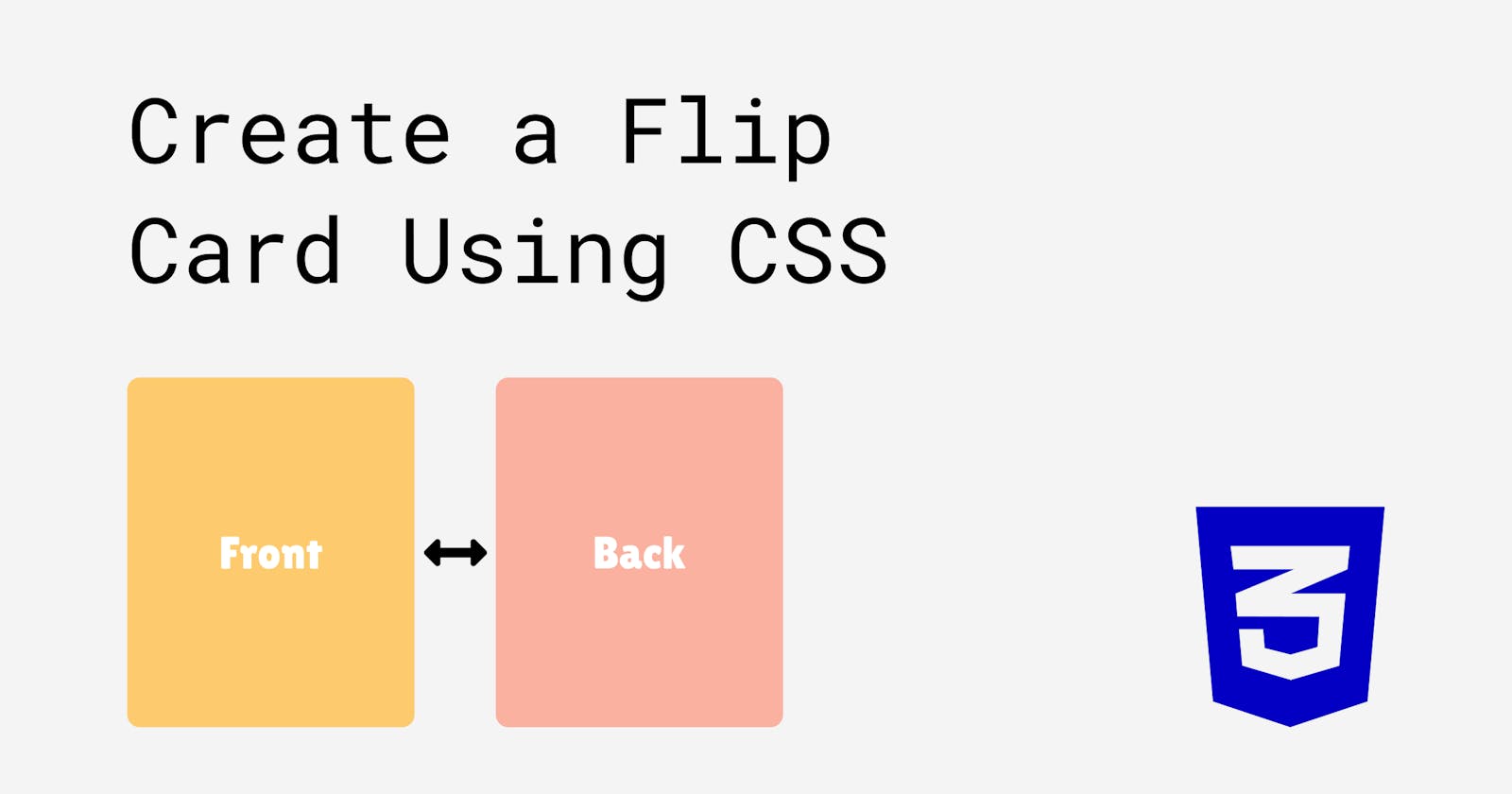
Within the "card" div, we're going to create two more div elements, which will represent the front and the back of the card respectively. Give the first div a class of "front" and the second div a class of "back". Write some text inside each to label them so we can see which card is where.
<div class="container">
  <div class="card">
    <div class="front">Front</div>
    <div class="back">Back</div>
  </div>
</div>
That's it for the HTML, let's get started on the CSS!
The CSS
I'm going to start off giving the body some styling so our card can sit nicely in the middle of the viewport.
body{
  height:100vh;
  display: flex;
  align-items:center;
  justify-content: center;
  font-family:'Lilita One';
  background:#00cec9;
}
I won't go into detail on the body styling as that's not the focus of the tutorial. I've also imported a font style from Google Fonts.
Container div
Our "container" element doesn't need much styling besides from a height and width, and we also need to set it to "position:relative" so we can display things inside it with absolute positioning. For now you can also give it a background so you can see the individual elements as we style them.
.container{
  position:relative;
  width:300px;
  height:400px;
  background:#f4f4f4;
}
Card div
The flip card is a child element of the container div, so we can use absolute positioning to make it the same size as the container. Setting the "card" a width and height of 100% means it will be 100% as wide and 100% as high as it's parent element, the "container" div. Give it a background colour different to the container so you can see how it occupies exactly the same space.
.card{
  position: absolute;
  height:100%;
  width:100%;
  transform-style:preserve-3d;
  transition:0.5s ease;
  background:yellow;
}
We also need to add "transform-style:preserve-3d" to our card div. If we don't include this, the flipping effect won't work properly - instead of seeing our "back" card, we would see the reverse side of the "front" card.
Think of it like a sandwich - if we wanted to flip a sandwich over and didn't use "preserve-3d", we'd end up just flipping the front slice of bread, not the whole sandwich.
We'll add a transition in as well, feel free to use your own values for this.
Front and back divs
Our "front" and "back" cards will also have absolute positioning, with a width and height of 100%. We're also going to give these a "backface-visibility" property and set it to "hidden". This means that the back face of the cards will be invisible when facing the user.
.front, .back{
  position: absolute;
  height:100%;
  width:100%;
  backface-visibility: hidden;
}
We also need to rotate the back card 180deg on its Y-axis. Since we added "backface-visibility:hidden", doing this will hide the card from view. Eventually, we'll flip the entire card which will make the back card visible and the front card hidden from view.
.back{
  transform:rotateY(180deg);
}
I'm going to add some a background colour to each of the cards to differentiate them, and use flex to centre the text inside them. The final code would look like this:
.front, .back{
  position: absolute;
  height:100%;
  width:100%;
  backface-visibility: hidden;
  background:#fdcb6e;
  color:white;
  border-radius:20px;
  display: flex;
  align-items: center;
  justify-content: center;
  font-size:2em;
}

.back{
  transform:rotateY(180deg);
  background:#fab1a0;
}
Card:hover
All that's left to do is add the hover effect that will flip our card over.
.card:hover{
  transform:rotateY(180deg);
}
So when we hover on the card div, the whole thing will flip 180deg on it's Y axis. This will make the back card visible, and the front card hidden.
That's it!
Easy right? Play around with your code, style it up some more and try to think about what each part of the code does. To really test yourself, delete the code and try typing things up from scratch.
If this article was useful to you, let me know on Twitter! - @jacobcollinsdev